Chart
Charts can be used to to record information or represent data. There are numerous types of charts, and while the terms "chart" and "graph" are closely related, they are not quite synonymous.
You can think of a graph as a picture used to represent numerical data. They can be as simple as a line on a page, or far more complicated depending on the context and the data. There are also numerous types of graphs, and some are more suitable for representing certain data.
Charts, similarly to graphs, present information in various forms, including in the form of graphs. Charts however can represent more than just numerical data. This means that while all graphs are charts, not all charts are graphs. Tables, diagrams, flow charts, and even maps, are also types of charts.
Common types of charts
A chart can take many different forms, usually represented with some kind of symbol. Some of the more common examples of charts include line charts, pie charts, bar charts, and histograms. Note that the charts below are just meant to show the different types of charts, and the data included is not exact.
Line chart
A line chart is a type of chart where one value is plotted against another in a series of line segments. It is similar to a scatter plot except that in a line plot, the data is in a specific order, usually based on the x-axis value. In the line chart below, height in centimeters is plotted against time in years.
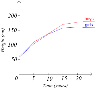
The line chart above is used to show changes over time. We can see that girls and boys are generally the same height up until puberty. After puberty, boys tend to start getting taller than girls, and continue growing for a longer period of time, while girls are shorter on average, and their growth slows and plateaus at a younger age.
Pie chart
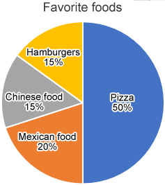
A pie chart is a type of chart that represents percentages in the form of slices of a pie. They are useful for giving a big picture of the proportions of the data being studied. The pie chart below shows the food preferences of a certain group of people.
Bar chart
A bar chart, also called a bar graph, is a type of chart that uses rectangular bars to represent values. The lengths of the bars are proportional to their values; the longer the bar, the larger the magnitude. Bar charts can be plotted either vertically or horizontally. They can be used in a number of different ways and are relatively easy to read and understand.
One way bar charts can be used is for comparing the number of times a specific event occurs at different points in time. For example, say a small school, that makes a point to bring in a cake for every student's birthday, were budgeting for the year. Since they know when all the student's birthdays are, they can make a bar chart to see how many birthdays they have a month so that they can budget accordingly:
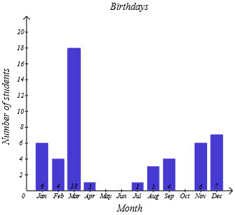
From this bar chart, we can see that a large proportion, 18 of the 50 students, have birthdays in March, so the school will have to allocate more money to the birthday budget in March. Since the bar chart shows the exact number of students with birthdays per month, as long as costs stay consistent, the school can know exactly how much per month they need to spend.
Histogram
A histogram is a type of chart that summarizes a set of values by grouping nearby values into groups called bins (or buckets). The histogram shows the number of values that go into each bin.
The bins are represented by a series of adjacent rectangles. Although they look similar to bar charts, the information they convey is different. Bar charts plot different categories of data, while histograms plot the frequency of the data within specific ranges (bins).
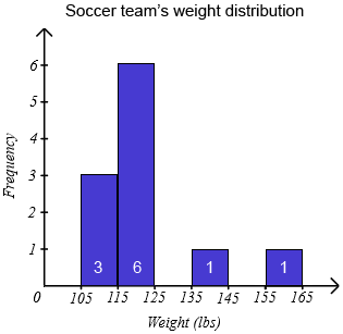
For example, say we're looking at the weights of the students on a boys high school soccer team. We find that the weights of the students range from 105 - 160 pounds and divide this range of weights into bins that each represent 10 lbs to see how students fall into each range of weights. Below is a table of the data as well as a histogram representing said data:
|
|
From the histogram we can see that most of the team falls within the 105 lb - 125 lb range, which makes sense as this is around how much high school boys weigh.