Graph scale
A graph scale, or simply scale, refers to a set of numbers that indicate certain intervals on a graph used for measurement. There are many different types of graphs, including bar graphs, histograms, line graphs, and many more. The scales on a graph, as well as the type of graph used, can significantly affect how the represented data is interpreted.
How to scale a graph
Choosing a graph's scale is an important aspect of data presentation. Depending on the scale chosen, the presented data may provide a comprehensive picture of the data, or it could misrepresent the data.
Things to consider when scaling a graph
The following list provides some things to keep in mind when selecting the scale of a graph.
- Select a range of tick marks on each scale (x-axis and y-axis) that includes all of the data to be plotted. Ideally the range should include all data points without being so large as to leave large amounts of blank space on the graph.
- If multiple graphs are being displayed, try to present the data using the same scale for each graph. If each graph has different scales, it can be difficult to compare and interpret the collection of graphs.
- Consider whether any particular value, such as 0, should be included in the scale. For example, if a graph is tracking sales of some product, graphing the target value along with the actual sales values would be helpful.
- The selected graph type and scale should appropriately reflect the key trends in the data being represented.
- Where possible, avoid having data points appear on the axes. This can make graphs difficult to read.
Graph type selection is also very important, since different graph types excel at presenting different types of data. For example, line graphs are helpful for emphasizing differences between values. On the other hand, bar charts are useful for displaying the absolute value of a given data point. Pay attention to the type of graph you select to represent data; if you are unsure what type of graph to use, plot the same data using various types of graphs to get a better grasp of the pros and cons of using each graph type.
The scale of the x and y-axis
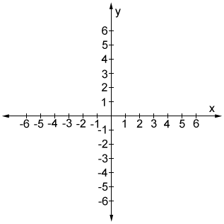
In general, the scale of the graph can differ between axes, but within an axis, such as on the x-axis of the coordinate plane, the scale is typically linear; each interval along the axis represents the same incremental increase. For example, each mark on the x- and y-axes of the coordinate plane represents 1 unit, as shown in the figure below.
It is also possible to have different scales on each axis. For example, each interval on the y-axis could represent 2, or even 10 units, while each interval on the x-axis represents 1 unit. As long as the intervals have consistent magnitudes within each axis (i.e. the interval is 1 throughout the entire x-axis for a given graph), the scale of each axis can be very different.
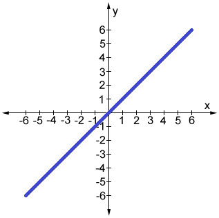
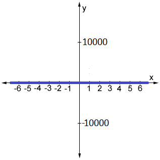
Consider the graph of the line y = x. If we were to use the standard coordinate plane, where each tick mark represents 1 unit, we can clearly see the graph of the line y = x in the figure below (left). However, if we were to select a large range for the y-axis such that each tick mark represents 10,000 units, the graph of the line y = x would look like it overlaps with the x-axis (right):
|
|
Although the above example is extreme, it illustrates the importance of graph scales. There are many cases in which data can be obscured by an improperly selected scale. Another example is data in which the variations are very small (much smaller than 1). In such cases, a typical coordinate plane in which each tick mark represents 1 unit would be too large, and it may not show behavior in the graph we would otherwise see with different scaling.
Other types of graphs and scales
A coordinate plane is only one example of graph scales; there are numerous others. However, the same principles can be carried through many different types of graphs. Below is an example of a line graph in which the x-axis and y-axis have different intervals that are specifically chosen to ensure that the data presented is clear.

Although most basic graphs use a linear scale, it is worth noting that there are also different types of scales, such as logarithmic scales. A logarithmic scale is one in which each interval represents the subsequent power of 10. On a logarithmic scale, the numbers 10 and 100, and 30 and 300 are equally spaced (in a linear scale, 10 and 20, and 30 and 60, would be equally spaced). Logarithmic scales are useful when trying to concisely display data over a range of values in which the largest value is much larger than the smallest.
Because there are so many ways to present data, it is important to understand what type of graph(s) to use, as well as what scale to use, in order to most effectively present the data.