Data and graphs
Data (singular: datum) are facts or information gathered (typically through observation) usually to be analyzed and interpreted for some specific purpose. Data can be represented in a variety of forms, using numbers, words, graphs, measurements and more.
There are two broad categories of data: quantitative data and qualitative data. Qualitative data describes attributes such as taste, smell, color, texture, sound, etc. Quantitative data is data that can be measured and represented numerically. Below are a few examples of both.
Qualitative data
- A person's favorite food
- The color of a car
- The texture of a dress
Quantitative data
- Height
- Weight
- Number of students
Data can be further categorized as discrete or continuous. Discrete data can be thought of as data that can be exactly counted, while continuous data can be thought of as data that is measured. Discrete data can only take on distinct values. The numbers on a standard die are discrete values (1, 2, 3, 4, 5, 6). They can only take on one of those six values.
In contrast, continuous values can take on any value within a range of values. Height is an example of continuous data. Although it is typically reported as a discrete value, a person who is 5'8" is unlikely to be exactly that height. If we were to measure the heights of two people who have reported heights of 5'8" in units that are sufficiently small, it is highly unlikely that they would be exactly the same height. Rather, one may be 5'8.1029" and the other some other height.
Data and statistics
Data is a large part of almost every aspect of human life that involves organization such as scientific research, finance, business management, and much more. Data is collected so that it can be analyzed for some specific purpose. In scientific research, data is used to support or refute some hypothesis. In business management it is used to analyze sales, revenue, profits, etc. In order for all of this to happen, most data needs to be processed and presented in a way that humans can understand and interpret. This is done using visual representations of data such as graphs.
Graphs
A graph is a visual representation of data intended to make it easier for people to interpret and understand large quantities of data. Imagine for example that there is a class of 50 students, and the teacher wants to determine the number of birthdays that occur each month. Realistically, the teacher would probably ask for a show of hands of birthdays in each month, count the number of hands, and record the result. For the sake of argument however, imagine that the teacher asks each student individually what month their birthday occurs in and notes their responses:
Jan, Sep, Jan, Jul, Jan, Mar, Dec, Mar, Mar, Feb, Sep, Feb, Jan, Nov, Jan, Jan, Feb, Aug, Feb, Mar, Nov, Mar, Dec, Mar, Nov, Mar, Mar, Aug, Mar, Dec, Mar, Mar, Nov, Sep, Mar, Mar, Mar, Dec, Sep, Mar, Apr, Mar, Nov, Mar, Dec, Mar, Aug, Nov, Dec, Dec.
The teacher now has to determine the number of birthdays each month by counting each. This is a tedious task, and if the teacher were trying to present this data, the above method would be highly inefficient, and likely not well received by the audience. Instead, the teacher should organize the data using some type of chart or graph. Two possible options are a table or a bar graph:
Birthdays
| Month | Number of students |
|---|---|
| January | 6 |
| February | 4 |
| March | 18 |
| April | 1 |
| May | 0 |
| June | 0 |
| July | 1 |
| August | 3 |
| September | 4 |
| October | 0 |
| November | 6 |
| December | 7 |
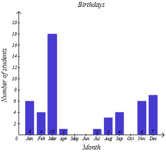
In either case, the data is much easier to interpret than the list of every student's response. Using a graph, we can also start to see patterns in the data such as correlations, trends over time, frequency, and much more. In this particular case we can see that there is a disproportionate number of student birthdays in the month of March, and we may wonder why this is the case. Without more data, it wouldn't be possible to determine whether this is purely coincidence, or if there is some particular reason for this trend. However, this example still demonstrates that data, and particularly effective visual representation of data through use of graphs (and other tools), gives us the opportunity to find patterns in data that we may not otherwise see.
There are many different types of graphs, and it is important to learn about some of the most commonly used graphs so that we can read and interpret data, something that most people will have to do at some point in their lives.