Pie chart
A pie chart, also referred to as a pie graph is a graph in the shape of a pie, or circle, that shows how a total amount has been divided into parts. In other words, a pie chart gives us a visual representation of the numerical proportions of the data being studied.
The pie, or circle, represents the total amount. The slices of pie show how the total amount has been divided:
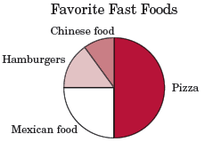
In the figure above, the pie graph demonstrates that the favorite fast food in the sample was pizza, followed by mexican food, hamburgers, and chinese food.
Pie charts can be very useful because even without explicit values, like in the figure above, they can give us a fairly quick way to gauge the relative sizes of whatever we're looking at. They are also easy to construct and understand and thus are commonly used when relative size is relevant to the data.
However, pie charts do not come without drawbacks. While they can be helpful as stand-alone graphs to give you a quick idea of relatively simple concepts, it can be difficult to compare different sections of a pie chart or multiple pie charts. In such cases, other graph types can be more effective and easy to use. That being said, it can be useful to know how to construct your own simple pie charts.
How to make a pie chart
First, compile your data. Let's use the example of favorite food types again, but assign slightly different values. Assume that we have a total of 200 people voting on their favorite foods. The results show:
| Favorite food | # of votes |
|---|---|
| Pizza | 100 |
| Mexican food | 40 |
| Chinese food | 30 |
| Hamburgers | 30 |
| Total | 200 |
Next we have to determine what percentage of the total each of the foods makes up. We can find out by dividing the number of votes for each food by the total number of votes, then multiplying the decimal by 100 to find the percentage.
| Pizza: |  |
| Mexican food: |  |
| Chinese food: |  |
| Hamburgers: |  |
50% + 20% + 15% + 15% = 100%, which confirms that our math is correct since the total percent must add up to 100%. Now we want to express these percentages in terms of a circle. A circle has a total of 360°, so we multiply each percent by 360° to find what angle of a circle the percent represents.
| Pizza: | 50% × 360 = 180° |
| Mexican food: | 20% × 360 = 72° |
| Chinese food: | 15% × 360 = 54° |
| Hamburgers: | 15% × 360 = 54° |
Again we can quickly check that this is correct by summing the angles: 180 + 72 + 54 + 54 = 360°.
Now we're ready to actually ready to draw the pie chart. Refer to the compass and protractor pages if you need a refresher on how to use them, then follow these steps:
- Draw a circle with the compass
- Use a protractor to divide the circle into whatever number of regions you have, based on their angles; in this case there are four regions with angles 180°, 72°, 54°, and 54°
- Label each region with what they represent, and the percentage that they make up
Once finished, the pie chart should look like the figure below:
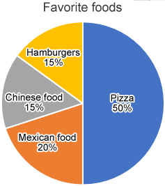
Looking at this pie chart, we can see that many more people like pizza than mexican food, chinese food, or hamburgers, so the chart is very useful if we're trying to figure out what food to order for this group of people. However, we can also see that 20% and 15% are barely distinguishable on a pie chart. This would be even more true if there were more values, and the difference between the values were even smaller, so this example also shows the limits of pie charts.