Box plot
A box plot, also referred to as a box and whisker plot, displays how elements in a data set are distributed throughout the set using a five number summary:
- Minimum - smallest value in the set; it is the left-most point of the plot.
- First/lower quartile (Q1) - the number below which 25% of the data in the set lies. On a box plot, Q1 is the left side of the box.
- Median (Q2) - the middle of the data; it splits the lower and upper 50% of the data. Q2 is indicated by a line inside the box at some point between Q1 and Q3.
- Third/upper quartile (Q3) - the number below which 75% of the data in the set lies. On a box plot, Q3 is the right side of the box.
- Maximum - largest value in the set; it is the right-most point of the plot.
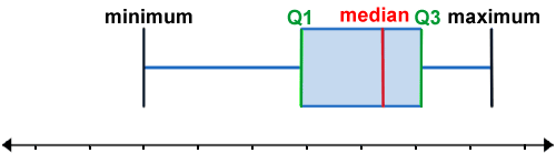
Note that box plots can also be oriented vertically, by rotating the plot counter-clockwise. The above would still apply except that "left" would refer to the bottom of the plot while "right" would refer to the upper part of the plot. Also, the "whisker" in the box and whisker plot refers to the lines between the minimum and Q1, and Q3 and the maximum.
Although box plots may not provide as much detail as other methods of displaying data, such as a histogram, box plots are useful in that the information they do provide is presented in a manner that is compact and can be interpreted quickly. For example, in addition to providing a five number summary, box plots also enable us to quickly determine whether the data is skewed, how tightly the data is grouped, and whether it has any outliers. Because of how compact box plots are, they are also useful for comparing a large number of observations as well as for simultaneously comparing multiple data sets.
How to construct a box plot
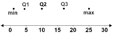
Constructing a box plot involves determining each value in the five number summary. Note that the elements in a set of data must be ordered from least to greatest to determine the values in the five number summary. Use the following data set as a reference.
{1, 3, 4, 5, 5, 7, 10, 11, 11, 16, 18, 18, 25}
1. Find Q1, Q2, Q3, the minimum, and the maximum.
- Q2, or the median is the middle value. If there are an odd number of values, the median is the middle-most value. If there are an even number of values, find the average of the two middle values. Median: 10
- Q1 is the middle number between the minimum and the median. In this case, Q1 is between the 3rd and 4th elements, which are 4 and 5, respectively. Thus, Q1 is the average of 4 and 5. Q1: 4.5
- Q3 is the middle number between the median and the maximum. In this case, Q3 is between the 10th and 11th elements, which are 16 and 18, respectively. Thus, Q3 is the average of 16 and 18. Q3: 17
- The minimum is the smallest value. Minimum: 1
- The maximum is the largest value. Maximum: 25
2. Once the five number summary is calculated, make points for each value in their corresponding positions over a number line:
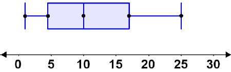
3. Draw lines through each point. Connect the three middle points such that they form a rectangle. This rectangle is the IQR.
4. Draw lines from both ends of the IQR to their respective extrema. These lines are the whiskers of the box plot. The box plot for the above data set is shown below:
Interpreting box plots
Box plots are used to quickly get a sense of the distribution of data. They are commonly used to compare multiple sets of data simultaneously. The shape of the box plot provides information about the data such as how spread the data is. For example, a box plot that is very short means that most of the values are close to the median (smaller range), while a longer box plot means that values are more spread out (larger range). Box plots are commonly described as being symmetrical, skewed to the left, or skewed to the right.
Symmetrical distribution
If the data is symmetrical, the median will be in the center of the box, meaning that the distance between Q1 and Q2 is the same as that between Q2 and Q3:
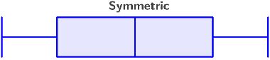
A symmetrical distribution indicates a normal distribution, meaning that there are few exceptionally large or small values. In a symmetrical distribution, the mean and median will be relatively close in value.
Skewed-left distribution
If the median is closer to the right side of the box (Q3), the data is said to be skewed left. This means that the values between Q1 and the median are more spread out than the values between the median and Q3 (Q2 - Q1 > Q3 - Q2):
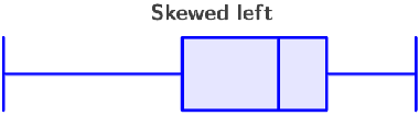
A distribution that is skewed to the left indicates that most values are large, but there are a few exceptionally small values that result in the mean being pulled to the left. Also, the mean will be less than the median, and the left whisker will be longer.
Skewed-right distribution
If the median is closer to the left side of the box (Q1), the data is said to be skewed right. This means that the values between the median and Q3 are more spread out than the values between Q1 and the median (Q3 - Q2 > Q2 - Q1):
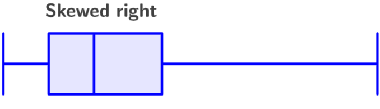
A distribution that is skewed to the right indicates that most values are small, but there are a few exceptionally large values that result in the mean being pulled to the right. Also, the mean will be greater than the median, and the right whisker will be longer.
Interquartile range
The construction of a box plot is based on the quartiles of a data set, which divide the data roughly into fourths. Each quartile therefore represents roughly 25% of the data. Depending on the number of elements in the data set, certain quartiles may contain a greater number of values than another. One of the key metrics displayed by a box plot is the interquartile range.
The interquartile range (IQR) is comprised of the middle 50% of the data. It is the difference between Q3 and Q1, and is a useful measure of spread. For example, given multiple box plots, those with a smaller IQR (shorter box) indicate that data is closer to the median while those with a larger IQR (longer box) indicate that the data is more spread out.
The IQR is also used to identify outliers. Typically, any data point that is further than 1.5 times the IQR is considered an outlier. As such, when constructing a box plot, each whisker extends to the furthest data point that is within 1.5 times the IQR.