Frequency distribution
A frequency distribution is a visual representation (chart, table, list, graph, etc.) of how frequently some event or outcome occurs in a statistical sample.
The table below shows the frequency distribution of people in line at a movie theater categorized by age.
| Age range | Frequency |
|---|---|
| 15-19 | 6 |
| 20-24 | 15 |
| 25-29 | 25 |
| 30-34 | 18 |
| 35-39 | 4 |
| 40-44 | 2 |
Frequency distributions can be useful for depicting patterns in a given set of data. For example, the distribution above shows that the most common age of people in line was 25-29. Also, about 83% of people at the theater fell within the age range of 20-34. Knowing information like this helps the theater make more informed decisions based on their customers.
How to construct a frequency distribution
There are a number of types of frequency distributions. The table above is an example of a grouped frequency distribution, which is a frequency distribution with a large range of values such that the data is usually grouped into classes that are larger than one unit in width. A class in this context is a quantitative or qualitative category. For example, in the table above, each age range is a class, so there are 6 classes.
Constructing a grouped frequency distribution involves identifying and organizing classes, then counting the observations/outcomes that fall within the classes. Some general steps for constructing a frequency distribution are listed below:
- Determine the range of the set of data. The range is the difference between the largest and smallest values in the set.
- Choose an appropriate number of classes. Different formulas can be used to estimate the ideal number of classes, but these formulas are not a hard rule. When choosing the number of classes, it is most important to choose a number that provides information about the data that we are interested in. Too few classes may not tell us much about how the data is organized while too many classes may not tell us much about any particular class. As a rule of thumb, between 5 and 20 equal interval classes are commonly used. Formulas for estimating the ideal number of classes (C) given the total number of observations (n) include:
- C = 1 + 3.3log10n
- C =

- Divide the classes into intervals of equal length by using the following formula then taking the ceiling (the least integer greater than the result; e.g. the ceiling of 4.1 is 5) of the result:

- Choose the starting point of the classes. It is common to start the classes from the lowest value, though starting from the highest values is also possible. Add the length of the class interval to the starting value to determine the lower value in the subsequent class interval. Subtract 1 from the result to find the upper limit of the previous class. Continue this process for each class.
- Tally the scores in the appropriate class intervals to determine the frequency distribution.
Example
Construct a grouped frequency distribution with 6 classes using the scores that students in a class obtained on their statistics exam: 45, 48, 52, 55, 62, 63, 66, 70, 70, 72, 73, 76, 77, 77, 80, 81, 84, 85, 85, 88, 90, 91, 95, 97, 98.
The range of scores is:
98 - 45 = 53
The class interval is:
53 / 6 = 8.8
The ceiling of 8.8 is 9, so each class interval has a length of 9.
Choosing 45 as the starting point, the next class interval begins at 54, and the first class interval ends at 53. The remainder of the class intervals are shown in the table below along with the sum of the tallies of scores in each class interval:
| Class | Frequency |
|---|---|
| 45-53 | 3 |
| 54-62 | 2 |
| 63-71 | 4 |
| 72-80 | 6 |
| 81-89 | 5 |
| 90-98 | 5 |
Class midpoints in a frequency distribution
The class midpoint of a frequency distribution is the average of each class in a frequency distribution. It can provide more information about the distribution of a data set and is also helpful for creating a histogram. The class midpoint can be computed as follows:

Thus, the class midpoints for the frequency distribution in the example above are:
| Class | Frequency | Midpoint |
|---|---|---|
| 45-53 | 3 |  |
| 54-62 | 2 |  |
| 63-71 | 4 |  |
| 72-80 | 6 |  |
| 81-89 | 5 |  |
| 90-98 | 5 |  |
Frequency polygons
Frequency polygons are a graphical representation of frequency distributions. They are similar to histograms.
Example
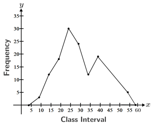
Graph the following frequency distribution given data for the time taken for students to complete a test.
| Time (minutes) | Frequency | Midpoint |
|---|---|---|
| 2-6 | 0 | 4 |
| 7-11 | 3 | 9 |
| 12-16 | 12 | 14 |
| 17-21 | 18 | 19 |
| 22-26 | 30 | 24 |
| 27-31 | 20 | 29 |
| 32-36 | 12 | 34 |
| 37-41 | 19 | 39 |
| 42-46 | 21 | 44 |
| 47-51 | 17 | 49 |
| 52-56 | 5 | 54 |
| 57-61 | 0 | 59 |
To graph the frequency distribution, plot the frequency vs. time using the midpoint for the x-value:
Frequency distributions can be represented in a number of other ways as well, including bar graphs, histograms, box and whisker plots, and more.