Scatter plot
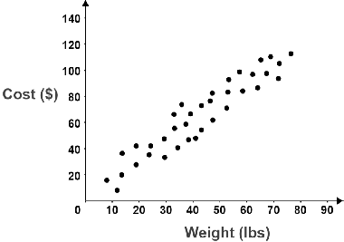
A scatter plot is a type of plot that displays values, typically for two variables, using cartesian coordinates. Scatter plots are often used when studying the relationship between two variables. Below is a scatter plot showing the relationship between the cost and weight of some product:
Correlation
Scatter plots can show various types of correlations between variables.
Positive correlation
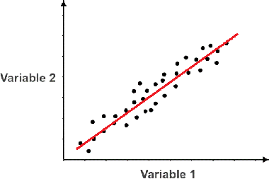
A positive correlation is one in which the two variables increase together. In the scatter plot below, the red line, referred to as the line of best fit, has a positive slope, so the two variables have a positive correlation.
Negative correlation
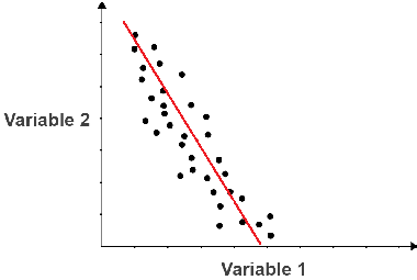
When two variables have a negative correlation, one variable increases as the other decreases. In the scatter plot below, variable 2 decreases as variable 1 increases, so the variables have a negative correlation. This is also shown by the fact that the line of best fit has a negative slope.
Non-linear correlation
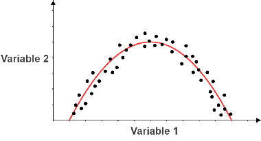
A non-linear correlation is one in which a pattern exists between the two variables that cannot be described by a straight line. Although the two variables in the figure below do not exhibit any linear correlation, we can see that they do still have a pattern. In this case, the line of best fit is a parabola, so the data has a non-linear correlation.
No correlation
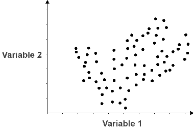
The two variables below do not exhibit a discernible pattern, so they have no correlation.
Sketching a line of best fit
Given that two variables seem to have a linear correlation based on the scatter plot, the following guidelines can be used to sketch a line of best fit:
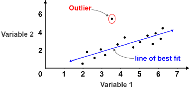
- Ignore any outliers as they are not part of the linear relationship between the two variables.
- The line of best fit does not necessarily need to contain any of the points in the scatter plot. There should be approximately as many points below the line of best fit as there are above it.
- The dots above and below the line should be more or less equal in distance from the line.
The figure below shows an example of a line of best fit where an outlier located at (3.5, 5.5) is ignored since most of the points are relatively close together except for said point.